Thursday, July 25, 2024

Red Ronin - Thoughts


It takes a lot of guts to look at sliding block puzzles and think, "You know, if only there was a way to fit some Hotline Miami in here!" Despite reeking of a drunken 2AM epiphany, Red Ronin seeks to do exactly that, marrying ponderous ice physics with violent, frenetic action. And while this blood-soaked Sokoban appears to be a smash hit in its first chapter, Red Ronin's ugly bits will eventually unfurl as its concepts vie for attention. The puzzle side of the game will argue for more complex and methodical setups, while the violence demands more reflex-based traps and harder boss fights. Red Ronin likes to believe these two concepts can work out their differences, but their incessant tug-of-war-ing will come at the cost of the player's patience—and sanity.


At the very least, Red Ronin shows that its premise has legs. Enemies are restricted to moving a square at a time but the protagonist can zoom across the arena until she collides with an obstacle, slicing up any opponents in her path. While you'll feel like a murderous bolt of lightning in the first chapter, each subsequent chapter introduces its own unique speed bump: patrolling bots that kill upon contact, enemies with 2 hp, lasers that sweep across the arena, and plenty more. As mechanics are added the odds will be increasingly stacked against you, forcing you to lean heavily on the game's two collectible resources: time-stop and mid-direction change.

These abilities are integral to Red Ronin as a puzzle game, as a good chunk of the challenge comes from where and when you'll use them. At first these power-ups seem like a cool way to allow for some player expression in battle, letting you take shortcuts to the end of a fight with smart ability use. That, and any leftover power-ups can be taken into the next battle, which can give you a leg up on a tricky opening. But as the game goes on your freedom to use these power-ups diminishes, until you're forcibly chaining them together in a conga line atop a tight rope. The game is absolutely better with the power-ups than without them, but the level of restriction Red Ronin prefers is that of a straight-jacket, offering little room for personal flair, style, or even mistakes. Puzzles often have one solution, and dallying outside that golden zone will undoubtedly result in a swift and decisive death.

Despite the game's numerous issues (which I'll get to shortly), what miffed me most of all was the lack of a rewind function. A good portion of the game's eccentricities may boil down to personal preference, but how do you miss adding a way to undo actions in your turn-based puzzle game? This is an issue that only gets exasperated as the game gets harder, seeing as deaths send you back to the start of a battle, instantly undoing an upwards of twenty or thirty inputs. And since there's little flexibility in how you move through a level, you'll often be memorizing the exact inputs required to get you to the spot you previously died at—and then you better pray you can figure it out from there. Stage inputs will be burned into your retinas as you run through the first half over and over and over again, with small mistakes weeding their way into your actions due to sheer fatigue. The lack of a rewind function may start as an understandable omission, but it won't take long before you'll see it for what it truly is: inexcusable.


While no rewind is a slow-killing poison for Red Ronin, a more immediate and pressing problem the game has is that it isn't strictly turned based. Laser traps and bosses break out of this constraint, operating independently of your turns and actions. This means that as you're sitting there trying to work out your next best move, a boss can put you in his crosshairs and blast you all the way back to the start of the fight. However this rule-breaking is also strangely infrequent (barring Stage 6), meaning you never really get to train the reactions required to play Red Ronin like a coked-up samurai. It's an uncomfortable pivot; for 90% of the game you'll be allowed to play as slow and methodically as you want, but the last 10% thrusts you into a Guitar Hero duel, where missing a single note incurs a reset. Naturally, it's here where you'll rack up most of your deaths, as you'll be backed into dead ends constantly via bad judgment, sloppy execution, or (most likely) a sad combination of the two. For the slower players out there, the bosses are likely where Red Ronin shall bury them.

Strangely, however, reactive players don't get a much better treatment since the game lacks (noticeable) input buffering. Hitting a direction mid-slide doesn't queue that movement up when the slide ends, which makes the protagonist feel sluggish and unresponsive, as if she's taking a leisurely breath between actions. This can lead to a lot of stupid deaths where you're thoughtlessly inputting a correct sequence of actions (up-left-up-right-down) but if you don't wait for each animation to finish an input gets dropped somewhere (up-left-right-DEAD). Worse yet is that activating your abilities can freeze the real-time bosses but only when they're between their actions, meaning occasionally you'll miss your window to pause the boss fight due to a lingering animation. And then the boss with throw bombs at your feet, then the game will pause (but not the bomb timer), then you'll be frantically trying to unpause the game, and then finally blow up mid-slide to safety.

Even if the issues I mentioned so far weren't present, I still wouldn't call Red Ronin perfect. Not only are its puzzles too exacting for a game trying to be stylish and smooth, but critical information is easily muddled by the amount of enemies on screen. Foes lack a visual "danger zone" that lets you see their striking range, hiding the fact that they both move and attack adjacent squares. Although you'll learn this lesson very early on (the hard way), I think it would still be helpful to see their striking range with the press of a button. As more enemies are added into the fray it can be hard to parse which of them will move in what direction too—like, if there was an enemy to your bottom left and one to your bottom right, figuring out which of the two will move into the bottom middle spot first could be integral to your survival. This only gets worse as big guys and far-reaching foes are thrown into the mix, muddying things until there's not much else you can do besides blindly search for the correct path. Ultimately, as fights grow more chaotic and frustrating, you'll come to rely on trial and error to find the way out, which isn't nearly as satisfying as outsmarting your opponents.

Lastly—and I'm hesitant to even mention this—but the story is surprisingly not good. A "cyberpunk revenge story" doesn't need much besides a good aesthetic and cool tunes to listen to, but I was surprised by just how unfulfilling Red Ronin felt. It's main character is a selfish, thoughtless, bitter human being, bosses are weirdly flippant when staring down their would-be murderer, and any pathos the game shows in its dossiers is gone as soon as characters open their mouths. On top of this, the game opens with a cliche, in media res hook of falling of a building—and that scene is nowhere in the game! The whole thing ends on a cliffhanger! For most other video games I usually handwave away the story when it's not that strong, but here I was left flabbergasted by just how hard Red Ronin missed the mark. And it was such an easy mark to hit too!


I don't regret playing Red Ronin but I can't help but feel overwhelmed by its disappointments. I think part of it is that I find the concept really fascinating; most of the time action games get infused with puzzle elements, and not often the reverse. Throw in the fact that Sokoban puzzle games are a dime a dozen, and Red Ronin manages to shine all the brighter: it's nakedly violent, constantly creative (new mechanics every level!), and isn't afraid to give the ol' noggin a workout. But its strengths are diminished by too many asterisks, its two-faced nature splitting the experience in half instead of coming together. If you decide to try it, enjoy the first level—because it's all downhill from there.

Thursday, July 11, 2024

Jetboard Joust - Thoughts


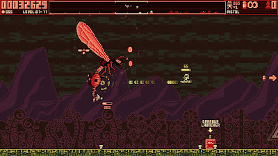
Jetboard Joust is a weird game that flounders like a fish out of water. Don't be fooled by its sharp retro aesthetics and vibrant art—there's a lot going wrong under the hood. You may be able to wrangle its chaotic gameplay and eradicate its volatile enemies in the first few stages, but gradually Jetboard Joust spirals into madness, eventually exploding—gleefully—into a fireball of noise, pixels, and flashing lights. Most of the game's issues can fit under the general umbrella of "needs tweaking", but I'm not convinced months of edits and updates could save Jetboard Joust. The rot at Jetboard Joust's heart is less tangible and more philosophical: it doesn't know what to do to make itself fun to play.


In Jetboard Joust, you're tasked with fending off an alien invasion on five worlds, each world comprised of eleven stages. For each stage you'll have to eliminate an unspecified number of alien waves while protecting itty-bitty alien kids from abduction. Should the alien babies get whisked off to the top of the screen, a super strong enemy will spawn... which isn't that big of a deal as a single joust can obliterate it. Sure, you'll lose a little bit of money at the end of the stage as a punishment, but ultimately saving the tiny tots is optional. Hell, it might even be preferable to let some of them get vaporized, considering how often the abduction alarm will be ringing in your ears. That, and the unskippable "civilians saved" animation work towards making you actively detest the helpless dummies you're trying to protect.

Luckily they'll be an afterthought most of the time, as you'll be dealing with a wide variety of alien menaces. As negative as my impressions are for the game, there are a decent amount of weapons and enemies to play around with, both of which expand as you make your way through the campaign. The most common enemy you'll face are fellow jetboarders, which can range from cannon fodder to aerial assassins—depending on what weapons are mounted to the tips of their boards. Like you, jetboarders have access to a huge assortment of armaments—specifically, your armaments. But unlike you, they're not bound by ammunition or feeble human reaction times, allowing them to wipe the floor with you should you misjudge the reach of their firearm. And that'll happen a lot, given how absurdly chaotic the screen gets as enemies rapidly populate it, all of them salivating for your demise.

Jetboard Joust's obsession with swarming the player is the first of its many pitfalls, as it turns the game's later worlds into an indecipherable gamble. Both the number of waves and enemies contained therein increase the further you get into the game, to the point that a single screen can be jam-packed with twenty or thirty foes you need to be reacting to. Worse yet is that enemies can vary wildly in firepower, capable of dealing anywhere from a sliver of damage to half of your health bar, and you have nearly no invulnerability frames, which allows a single misread to tank a run. Not since Wizard of Legend have I played a game where death is so effortlessly paid out to the player!


That's not to say Jetboard Joust is a hard game however, as it's fairly lax outside of a few glaring instances. Health and ammo are guaranteed to drop as long as you're doing a little bit of damage to your foes, a merciful mechanic that you'll need in order to survive the game's longer waves and boss fights. You'll heal to full health in between each stage and saving up enough money will allow you to purchase an extra life if you happen to fall in battle. Plus you're guaranteed an extra life before the big boss fight that caps off each world, which you can use to get a good handle on their capabilities.

But the real crapshoot is in the game's guardian battles: special encounters that occur at the end of individual levels. The enemy pool for this is vast and fairly random, handing you anything from easily-dispatched trash mobs to a battalion of Enforcers: enemies that can easily demolish you even with your best weapon at the ready. God forbid they warp in with a sniper rifle or shotgun, because in either case you'll be space dust in seconds. Almost no other game I can think of has such polarizing finales, where defeat or victory can be determined in the first five shots—and you often have no idea on which side you'll end up on until the particle effects finally fade.

Of course, even during some easy encounters you'll still have a chance to bite the big one, largely because parsing the game's visuals is a challenge unto itself (turn off screen shake ASAP!!!) While screenshots make it look sleek, Jetboard Joust's adherence to two primary colors creates a lot of unintended noise on the battlefield, especially since a lot of the info given to you (ammo, health, lives, abductions) is presented in the same monochrome shade. At the very least, the game needed to offer the player character more colors in order to make them stand out more easily; having each weapon come with its own unique palette would've been an easy way to tell which armament you have equipped, instead of forcing you to rely on a small text blurb at the top right.


Jetboard Joust's weapons are unfortunately another aspect that ratches up the game's zany factor, ranging from Goldeneye's klobb-esque tickle machines to screen-clearing explosions. Two weapons will be granted to you at the start of a run and then you'll have to seek out the rest on the map selection screen, often foregoing valuable treasure or upgrades to do so. This pushes the player to rely on the armaments they're randomly given, especially since any new weapons acquired arrive at their lowest level, requiring thousands of dollars of investment to get up to snuff. But in an effort to get you to swap weapons often, Jetboard Joust reduces your ammunition to a comical degree, granting only a few shots before you have to change your weapons up. And did I mention you can only carry a single weapon at a time? The rest of your firepower will be scattered around the stage as tiny pick-ups, blending into the background and often getting in the way of much-needed power-ups like health and ammo. In order to survive you'll have to swap weapons constantly, especially when you start to rub up against the game's wholly unnecessary durability system (yes, really) in later worlds.

The only other weapons innate to your standard board are a largely ineffectual pea shooter with infinite ammo and the titular joust ability. Jousting is a neat concept—it's a high-powered horizontal attack that's doubles as both a dash and bomb—but when and where joust restocks pop up are completely random. At times you'll be well-stocked and able to joust across the screen to your heart's content, but other times you'll be frantically searching for a single drop in order to safely dispose of a pursuing Enforcer. Along with your weapons, you're able to upgrade your jousts (and armor) for an increasingly high price—but where weapons scale asymptotically jousts scale linearly, meaning they'll be a sunk cost for the endgame. At that point jousts are mainly used as a quick escape so you can go surface skimming for the right power-up.

While most of the game is a kaleidoscope of exploding pixels, boss fights are where Jetboard Joust's high-octane madness slows to a crawl. These head honchos have an awful combination of bad traits: every boss is equipped with astronomically high health and hard to hit weak points, factors which are barely tolerable on their own but a waking nightmare when paired together. Without the right weapon fights can go on forever, as none of the bosses (besides the last) are effective at killing you, let alone hitting you. Sadly, you'll be struggling to hit them too, blowing through your best weapon's ammo as they rapidly jiggle around the screen. Eventually you'll get lazy and slip-up, all in an attempt to speed the process along, and maybe even dying—which means you'll have to do the fight all over again from the beginning! Worse yet is that bosses can appear randomly in stage waves later on—and sometimes multiple in the same wave! It's completely random!

All of these flaws meld together to form a game that feels barely enjoyable, but what really kills my desire to touch the game again is its padded length. Jetboard Joust is interminably long for an arcade shooter, taking roughly four hours to beat if you know what you're doing. Add in the fact that it's a permadeath roguelite and you'll feel like putting it down for good when you die three hours into your run on the last world. Thankfully you can unlock warps to future stages as you play through the game, but you won't be able to keep your prior upgrades and weapons. Instead—bafflingly!—you'll be given a random assortment of better weapons and upgrades, meaning you're almost encouraged to die and start from each warp point in case you're having trouble. Sure, it robs you of the true ending, but you'll have to play the game from start to finish without warps to achieve that. And considering that every stage is exactly the same barring which enemies spawn in and where, you'll have felt like you've played the game ten times over by the first time you reach its end.


Like a moth to a flame, I continued to play Jetboard Joust, even after I knew I wasn't going to enjoy it. But I was curious just how much craziness was left, as the horizon burst into coins, laser beams, and random doodads scattered about the floor. In a way I was reminded of some horrendously balanced PS2 games like Chaos Legion or Extermination, in how they urge you to press on because you don't know how it could get worse—but you know that it will. Given how much love and attention was poured into Jetboard Joust I feel it's unfair to simply write it off as a bad game, but I know one thing: it certainly isn't a good one.

Sunday, April 21, 2024

Wolcen - Thoughts


A genre I didn't expect having so much resistance to is the Action RPG. I was an active participant in its heyday, having grown up on the unforgettable one-two punch of Diablo and Diablo II. But I suppose in retrospect I didn't play them a lot—or rather, I didn't play them as much as my peers tended to. After finishing both games, my relationship with ARPGs was mostly casual: I played Diablo 3 a decent amount, bounced off of Titan Quest and Path of Exile, and liked Grim Dawn but sadly never finished it. I've always kept my eye out for projects on the horizon that looked interesting despite my own personal struggles with the genre, because I was waiting for an experience to finally click with me.

Yet there's also an irrepressible, morbid side to my desires. I'm enthralled by broken dreams, overambition, and an out-of-depth arrogance. I love writing about games that fail the player, because even though I may detest the title while playing it, it's fascinating to pick apart a game's design and ponder what went wrong. That's why Wolcen has always had a giant red bullseye on its back, begging me to play it. The game released to aggressively mixed reviews on Steam and had its fanbase quickly burn out, despite receiving numerous post-launch updates in an attempt to resuscitate the community. And if the fans of the genre abandoned Wolcen, a game that by all impressions looks pretty good, then what hope did it have for me, a jaded apostate that has abandoned the genre?


Well guess what? Wolcen is fine. Well... "fine" is a bit of an oversimplification—Wolcen is a mediocre action romp that looks and sounds great but fundamentally misses the mark. It's not a game that will leave you itching to try out a different build or strategize around unique gear you discover; Wolcen is firmly a "play, theorycraft, and wipe your hands once done" type of experience. I think that kind of thing can be a huge disappointment for ARPG addicts looking for the next juicy hit to keep coming back to, but for someone like me that bounces quickly from game to game, it was an unexpectedly fun ride. Personally the best part of an ARPG is near its start anyway, when you first get to submerge your hands into the gooey, squishy clay that is character building—and Wolcen's clay reservoir is practically overflowing.

Besides its above-average presentation, the best thing Wolcen has going for it is a massive passive skill tree that puts Diablo IV to shame. It's not as mind-bogglingly large as Path of Exile but it's still deeper and wider than many of its contemporaries, giving you a ton of pathways and connections to mull over. You start by picking one of three core "builds" to focus on, and as you spread out you'll run into two secondary builds further in and four tertiary builds on the outer rim. You can also cross into adjacent builds pretty quickly and rotate bits of the web to make it easier to beeline for a tertiary build from the start. Additionally, there are larger nodes that grant build-defining skills sprinkled throughout, although most of the ones on the outer rim tend to come with a downside that make them risky to take (at least for my build). Still, no matter if you're big on experimenting with wacky triple-class shenanigans or laser-focused on damage of a single type, it's hard not to find something to love within Wolcen's giant web of possibilities.

The downside to all of this is that Wolcen's active skills fail to support the range of options here. Similar to the passive tree, there are three core active skill types: melee, range, and magic. You can pick up as many as you want (provided you have the money) but your access to them is limited by the weapon you have equipped (ie if you wield an arcane staff you can't use melee or range skills). While that may sound like an acceptable restriction, what kills the game's variety is that skills are woefully scant: there are 18 skills for magic, 13 for range, and only 12 for melee. With 6 skills able to be loaded into your hotbar, and most of them being simple do-damage doodads, it's going to feel like there's not much room for build variety. Wolcen tries to remedy this with a rune system similar to Diablo III (but with 16 skill runes instead of 5), but I never felt this made up for the lack of active skills on offer. If anything it made the game slightly more confusing to sift through, as a skill's true value was often hidden somewhere amidst its runes.


For my playthrough, I kept my build in Wolcen deliciously simple: I was a big strong lad that liked to smash things with his right-click hammer. I knew to follow ARPG 101: get a good damage ability, get a quick escape ability, and then everything else is supplemental (AoE, utility, buffs, debuffs, etc). Due to Wolcen's limited skills, the three non-damage supplemental abilities I picked up were the only three the melee class offered: a shout, an AoE buff, and a summon of all things. Everything else would compete for resources against my big bonk attack, and pretty early on I found the bonk to be unparalleled at pulping foes. I zipped across the passive skill web to pick up as many +physical damage nodes as possible, and when I ran out of those I doubled down on becoming a tank, pumping my resistances up to 55% across the board. It was a fun experience that kept me engaged for the most part—but I couldn't help but feel everything was so... arbitrary.

For instance, I spent a long time trying to figure out if I should be going for high HP or high resistance. I received plenty of gear for both builds and could easily pick up nodes to support whichever choice I made, seeing as they were both major pillars for melee builds. But what truly muddled my options was that raw and multiplicative numbers are hidden—you're only given the total of your statistics, not the raw value nor what it's being multiplied by. This forces you to flick back and forth between your stats tab and the passive skill tree with each change, as you're never really sure just how much "10% more resistance" adds to your overall resistance (for me it was closer to 2% total). The same is true for all damage types, attack speed, crit chance, force shield—basically every upgrade on the passive skill tree gets put into an equation you never get to see.

That's why it was so hard for me to figure out my defense strategy. Is 10% more resistance better than 8% more max HP when I can't see the cumulative total for either until after I level up? And considering the lightning-fast speed at which new gear dropped ("rare" quality? More like I "rare"ly get anything else), I was changing out my equipment so fast that old comparisons I made were immediately outdated. I wound up waffling between the two defense stats, ultimately looking for gear that provided both but willing to lean into resistance if the stat was high enough. I encountered a similar hurdle when I found a unique weapon near the end of the game, one that gave a huge amount of arcane bonuses if I switched to that damage type. But since Wolcen doesn't offer a way to save different loadouts or view your total stats while respeccing, I spent 10 minutes remaking my character to an arcane-melee man, saw my damage would be a tiny bit less, and then spent 10 minutes trying to rebuild my original bonklord. Thankfully respeccing is fairly cheap, but the process was so tedious and unproductive that I never again considered altering my build.


As far as the campaign goes, Wolcen does an admirable job, although the first three acts aren't anything to write home about. The story here is unabashedly about Warhammer 40k marines in a fantasy universe (so Warhammer?), bombarding you with an incredible amount of side chatter in an attempt to endear you to its lore. For some folks this will provide a great incentive to care about Wolcen's grim universe and quippy cast of characters, but for those used to every other ARPG, the dialogue will only get in the way of whatever media is playing on your second monitor. That, and the prose itself isn't particularly gripping; it reminds me most of 90s comic book writing, the kind you'd find under a Liefeld-esque cover where a gallon of blood drips off the main character's spiked gauntlets. As you play it you'll realize that Wolcen suffers from a self-consciousness problem: it's trying to be what it thinks is cool, and you can't help but notice the "trying" part while playing.

Wolcen's final act however, is definitely one of the most interesting things about it. In it, a big bad demon is coming to attack your hub city, and each time you embark on a mission he gets a little bit closer to arriving. In order to give yourself a fighting chance you have to pick and choose missions that will weaken him and his forces, along with bolstering your city's defenses and productivity. The final boss starts at roughly 15 levels above you, so your first attempt at tackling him will likely end in crushing demise. Afterwards, you'll be whisked back to the start of the demon invasion with only your gear, levels, and a few town upgrades intact. It's a cool idea with a tiny roguelite spin on it that I vastly prefer to the boring, dungeon-delving act structure that most ARPGs religiously follow.

But just like the rest of the game, Wolcen's final act is poorly thought out. Upgrading your town is cool in theory, but in reality you only have about two dozen upgrades to choose from, with a good chunk of those being "increase productivity for your city". Early on I thought the idea of a garrison was great since it could gather gold and items for you between missions, but the gold they accrued was pitifully low (2000?! When it costs 15k to build anything?!!) and the gear was worse than the whites I'd stumble across laying by the side of the road. Mission variety—while decent—was severely imbalanced too, with some missions taking over 10 minutes to complete while others (specifically headhunter) could be wrapped up in under 10 seconds. And the weirdest of all is that a bunch of postgame stuff (building structures, bounty maps, hunt trophies) would show up during this act but you can't interface with any of it until the final boss is slain. Like, why give me a bounty map or show me the trophy vendor when I can't access either? Why prevent the player from building the transmutation forge or enneract lab or salt baths until after the hardest battle has concluded? Ultimately the final act felt underbaked and aimless, reaching for greatness but falling short the way a middle schooler would playing college basketball.


Make no mistake: I liked my time with Wolcen. I don't feel comfortable calling it a good game, but it definitely didn't feel like a bad one—it's mostly just janky and imbalanced. Imagine a shiny new office desk with plenty of papers atop it, ready for you to scribble down your zany character builds. But on closer inspection you'll see that the desk's nails were never fully hammered in, the screws only slightly turned, and the panels assembled from disparate types of wood. The desk is sturdy enough that you can write on it for some 20 hours or more, but to spend longer than that—to feverishly draw harder than you have been—is to send the whole thing toppling down. Wolcen is a fine experience, but at the end of the day the classics of old will outlast it—and it won't be a surprise why.

Monday, April 1, 2024

Earth Defense Force: Insect Armageddon - Thoughts


[contains spoilers]

If you're curious what a western spin on Earth Defense Force looks like, then I would recommend to keep dreaming because Insect Armageddon is a grim portrayal. I may have been lukewarm on EDF 4.1 seven years ago, but that's largely because I didn't expect it to be a simple retread of EDF 2017 in a bigger, more bloated package. Insect Armageddon takes that formula and applies its own tweaks, producing a game that's similar in style but quite different in taste. Frankly: it's a colorless experience, one that swaps out cheesy authenticity for American pulp and jargon, rightfully earning its place as the worst game in the franchise.


Insect Armageddon can be lambasted for a plethora of reasons, including but not limited to: drab artstyle, short campaign, no large swarms, cliffhanger ending, boring music, and only a single setting for the entire game (city). While these shortcomings already condemn the game to mediocrity, what sticks out as the most egregious to me are the lesser details—things easily missed unless you're accustomed to the eccentricities of the series. I don't deny that a newbie could play Insect Armageddon and have some harmless fun with it, but they won't know what they're missing until they play a Sandlot title. And then, like the transition from Dominos to a New York pizzeria, the disparity will be staggering.

My first issue is one that immediately kills any kind of love I could have for the game: the chatter. Camp is ingrained in EDF's DNA just as much as its bald-faced commitment to its delivery. Insect Armageddon however, prefers its camp to be low brow and satirical, poking fun at itself rather than taking the alien invasion seriously. Gone are the worldwide updates, shocking monster reveals, and frantic cries of fleeing civilians—instead you'll mostly have your operator stoically telling you what to do all while your teammates crack terrible jokes. Prepare for comments like: "these bugs smell worse than my mother-in-law", "remember the Alamo!", and "forgot my deodorant this morning! Gonna have to burn this armor when this is done!" All of these are a far cry from the beautiful, inane simplicity of "go home, bugs!", "I agree, guns are the best!" and "do you like death? Then die!"

It's hard to put into words why this precise brand of camp—the self-serious corniness—is integral to the series, but I feel it's as essential as the act of shooting bugs itself. The difference between Sandlot's EDF and Vicious Cycle Software's is akin that between bad 70's sci-fi movies and films made by The Asylum. The former may or may not be aware of the tremendously low quality of its material, but it is committed to presenting it as an earnest and pressing tale. Meanwhile, the latter is made to entertain folks that grew up on such schlock, winking and nodding at the viewer over its own ludicrous script. In a way, you can derive meaning from the former—while the latter is intentionally devoid of it.

Similarly, Insect Armageddon thinks of itself as a big bug attack game, rather than a big bug attack story, prioritizing objectives over events. There's very little reason or urgency beyond what your handler tells you is "mission critical", and even those orders are one step removed from her, coming from a faceless bureaucracy (which the game tries to paint as morally dubious in a poor attempt to raise stakes). Gone is the focus on the human element in this equation: the boots on the ground trying to maintain their sanity and morale in an outlandish horror scenario. This ultimately keeps the player from investing in Insect Armageddon's storyline, as they're not fighting to save the world or their country or even a single town—they're simply doing their assigned mission. In other EDF games you're part of a (hyper) nationalistic, collectivist unit that knows that if it falls, so too will the world; in Insect Armageddon you're an expendable military grunt that will speak only when spoken to, and that doesn't bother you one bit.


Things don't fare better in the gameplay department either, as Insect Armageddon doesn't understand the power trip inherent in EDF's arsenal. In the other games, weapons sound weighty and pack a mighty punch, rocketing bugs off into the stratosphere after a congratulatory explosion of alien blood. Here however, it feels as though you're firing low-velocity needles into your foes, their corpses rarely bouncing into another block (before instantly disappearing). Rocketing hordes will never see their bodies careening off into the far reaches of space, and larger enemies brush off your shots entirely, sometimes spewing a meager pink mist to show you're hitting their weak spot. Compare that to the hectors in EDF 2017, where laying into one with an assault rifle sees them jostling around like a drunk frat boy atop a mechanical bull. From the sound to the animation to the reaction of the aliens, none of the guns in Insect Armageddon are made to be satisfying to use—and that's a death knell for a shooter the way terrible physics are for a platformer.

On the bright side, one of the things Insect Armageddon can laud over its older sibling is its class system. From here on out, EDF includes four distinct classes for players to swap between, and the series is all the better for it. But like with 4.1, progress between classes is not shared, so switching from Wing Diver to Fencer will have you starting from rock bottom progression-wise. Thanks to Insect Armageddon's experience system, it's not that hard to go from one class to another early on, as your health and weapons are meted out by your experience level rather than random drops out in the field. But this too comes with its own downside, as you no longer get to collect piles of goodies between every fight—instead, only health pick-ups dot the battlefield, which are more useless than usual as you'll rarely be returning from whence you came. Occasionally bigger enemies will drop a weapon pick-up, but these too are gated by level requirement—meaning if you pick up a level 4 weapon when you're level 2, then you better get to grinding soldier.

The only other thing Insect Armageddon got right are its new enemies. Although ticks prompt an annoying QTE mash-fest once they latch on, they're a good low HP swarm enemy to stay on the lookout for, and their big bad momma looks properly grotesque. Wasps are nasty aerial units that are good at distracting the player, mantises are mobile titans that are the right level of dangerous, and the daddy long legs is an awesome variation on the walking fortress concept that sadly doesn't see enough use. That's about all there are for new additions (though hectors are fairly different from their 2017 counterparts), and for as short as the game is, I think it did an admirable job of spicing things up... at least for the enemies.

The mission structure on the other hand is exhaustingly repetitive, constantly ferrying you from one ant hill or crashed plane to the next. Occasionally your battles will be broken up with a stationary turret or vehicle section, but it's nevertheless surprising just how unexciting and routine the game feels even with a five hour runtime. Part of the problem is that Insect Armageddon has a misguided preference for long missions, throwing two dozen waves of enemies at the player over the course of a single level, rather than the 3-4 waves you'd see normally. Each bug barrage gradually wears on the player as each wave pops up without reprieve—and given that this all takes place in the same washed-out city, it's not as though you'll feel progress moving from one mission to the next. Plus, the longer mission structure runs antithetical to EDF's giant armament selection, limiting the chances you have to experiment around with different weapon loadouts. By the end of the game, the only missions I remember with some clarity are the giant hector, ditch, and bug queen missions—the first because it's the quickest level to grind experience for, the second because it seemed to go on forever, and the last because I was completely unaware that it was the end of the game.

That's right—there's no mothership finale! It does indeed show up to shoot at you, but all you can do is flee from it, your tail tucked between your legs.


In retrospect, I think I was too harsh on EDF 4.1. I expected more out of the franchise... despite having not known that every game is more or less a remix of the very first Chikyū Bōeigun (including story beats, enemy design, and stage themes). After Insect Armageddon was over, I actually returned to EDF 4.1 for a couple missions just to make sure I wasn't imagining things. And nope—that game is still rock solid, even if it is too big for its own good. Insect Armageddon on the other hand I will probably never revisit. It's not abysmal nor a blatant waste of time, but the problem is that in a series so steeped in unflagging repetition, there's almost no reason to play an inferior iteration. Every other EDF game delivers on the promise of a world uniting to fight back against an alien menace except for this one, and because of that, I don't feel guilty leaving it behind.

Saturday, February 24, 2024

Stella Glow - Thoughts


From the word "go", Stella Glow shoots itself in the foot. For a handheld game, its offers a tantalizing package: a fun bundle of anime characters, an item crafting system, battlefields that make good use of height, some downtime relationship management, and hours of cutscenes to sit back and watch... er, read. But for every cool feature hides an ugly flaw, some so terrible that it makes it impossible to recommend Stella Glow to those that would admire it most. Which is a shame, because it can be an enjoyable experience when all the pieces finally come together...

... but to get to that point, you have to suffer through eight hours of the worst the game has to offer.


Stella Glow's introduction is interminably long. For the first five combats you'll be relegated to 1-2 characters, with only the main character capable of using special abilities. This keeps battles woefully basic, imitating oldschool RPGs where most encounters are optimally solved via attack spam. Except instead of battles lasting under a minute, Stella Glow's scuffles are painstakingly lengthy, filled with a lot of movement animations, buff/debuff notifications, and languid battlefield effects. By the second fight you'll be wondering when the game picks up; by the fifth you'll be dreading that it won't.

Finally assembling the core cast in Chapter 1 doesn't alleviate matters either, as they're too frequently separated from one another and lack diversity. While it helps having more characters on the battlefield to control, it will take some time for each character to learn an ability other than "big attack"—and since you'll be facing the same enemies for the entire game (there's a total of like, 20 monsters), battles won't feel more interesting as much as they'll just feel longerStella Glow touts itself as a strategy RPG, but there's very little "strategy" involved in its first quarter: simply whack enemies from the side and heal if low on health. Combat isn't just simple—it's rudimentary and lacking.

By the time you reach Amatsu (the game's Japanese-style "fire" city) your feelings on Stella Glow will likely settle. Most of the mechanics and systems finally plateau here: you'll get accustomed to the free time system, understand how to craft and use orbs, know what "tuning" entails, have a good grasp on the story, and know how to handle combat by this point. Each party member will have 1-2 abilities to alternate between during battles and you'll finally be given the chance to switch out party members for one another, curating a team you prefer. However, none of these ever coalesce to form a satisfying hook; Stella Glow will waffle for too long between mediocre and decent, rarely breaking out of those bounds in either direction. Ultimately I'd describe it as an "okay" game—and sometimes, "okay" can be worse than both good or bad.


Yet one categorically bad thing about Stella Glow—which will irritate you like a toothpick caught in your throat—is that the game is slow as molasses. I mentioned before that the animations were languid, but another baffling issue is how enemies will loiter in the turn order queue. Every creature on the map gets a place in the queue, and those that do less actions on their turn will have their next turn pop up quicker. But Stella Glow's enemies are the patient sort, calmly waiting until your characters approaches their doorstep to act... which constantly places them ahead of your active characters in the queue. Over and over again the camera will pan over to these slackers and wait a beat, obsessively reminding you how much of the battle still remains.

This may start off as a minor annoyance but it becomes downright vexing later, with entire turn order rows clogged with inactive enemies (seriously, try Sakuya's 2nd tuning mission and tell me with a straight face that it doesn't intentionally seek to waste your time). It never lets up either, with even the endgame missions featuring legions of enemies that will lazily sit on their hands and watch the fight unfold. This grievance alone is so exhausting that it dooms Stella Glow to the "do not play" dustbin, which is a shame because the solution is so simple (warp them in later or just skip their turns!) The only saving grace is that while you're in Amatsu, you at least get to while your time away with its awesome battle theme, the best theme in the game (outside of the final boss).

The conducting ability is perhaps the most novel concept Stella Glow brings to the table, but it's equal parts inventive and bewildering. As a battle unfolds, a five-tiered status bar at the top of the screen will slowly accumulate levels, which can be spent on powerful AoE abilities. The lower tiers can dish out devastating attacks or multi-target buffs, while the higher tiers are legitimately game-changing, granting a full-party HP/MP restore or disabling every enemy on the map for four turns straight. The problem with this is that the non-witch party members (those that can't be conducted) lose a lot of their value as the game goes on, and even then witches like Sakuya and Mordimort have flat-out worse songs than Lisette and Popo (the full-team-heal, full-enemy-shutdown duo respectively). I appreciate the options that conducting adds to a strategy-light game like this, but it only serves to remind me that more could and should have been done to broaden the playing field.

Although I've spent an ample amount of time bemoaning Stella Glow's failures as a SRPG, I should note that the game is actually half RPG, half visual novel—that is, expect to read it just as much as you play it. In the story-department Stella Glow fares much better (the protagonist in particular is thankfully level-headed and proactive), but I still wouldn't describe it as captivating, well-written, or deep. Expect some decent characters (Klaus, Rusty, and Hilda), some stupid characters (Keith, Marie, Nonoka), and some that fall in-between that you can't help but love how annoying they are (Popo, Archibald). It's moe-heavy, rebel-against-god fluff at the end of the day, even if the story does throw out some cool ideas here and there. For instance, the most ambitious portion of the story upheaves the happy-go-lucky status quo, dangling some serious stakes in front of the player. Sadly you'll likely see it coming a stage or two beforehand, and its melodramatic after-effects can linger for a little too long.


I had basically no experience with developer Imageepoch before playing Stella Glow, and now learning that this was their last title released, I'm not sure what to think after hitting the credits on their portable swan song. In a way, it leaves me kind of curious: this was their culmination after 10 years of video game development? Did they peak early with Luminous Arc? Do they even have any die-hard fans? In any case, none of this changes the fact that Stella Glow lacks the luster to be called a hidden gem. I think the best thing you can say about it is that it at least tries to be its own "thing", even if that thing is a housed inside a box of trite anime nonsense mixed with some of the slowest, dullest SRPG combat I've ever experienced. Oh well.

---------------------

Images obtained from: imdb.com, outcyders.net, gematsu.com, myshopville.com

Monday, February 12, 2024

Superliminal - Thoughts


Among gaming's innumerable copycats, the Portal-likes are arguably the most creative. That's due in large part to the imitators' aversion to copying the central portal mechanic; rather, what they fancy is Portal's sardonic writing, compartmentalized structure, and science-first focus. This tends to make it obvious when you're playing a puzzler that comes from the school of Portal—but thankfully it's a good school, encouraging its students to break Newtonian Physics in creative new ways.

Superliminal is a recent graduate from this school, one that earned high marks with a relatively obscure focus: perception.


Of course, video games are no stranger to visual trickery. Almost every genre utilizes silent warps and illusory walls (horror games are smitten with mind games), but there aren't too many crunchy puzzlers built around this idea. Major titles like The Witness and Antichamber feature a decent chunk of perspective puzzles to grapple with, but those are merely fractions of a larger, more surreal whole. Superliminal on the other hand simple is humble and down to earth, placing the player in an empty workshop where everything functions as you think it should. Well, except for the fact that you have the uncanny ability to expand and shrink objects just by touching them. But it's not your fingers that are doing the manipulating, oddly enough—rather, it's how your see objects in relation to their surroundings that changes their physicality.

The easiest way to explain Superliminal's mechanics is to harken back to being a bored kid. There isn't a child alive that could resist bringing their index finger and thumb close to their eye and squishing members of their family, all while making a loud, wet "pblsbh!" noise. Depth is ignored in this silly action, rendering the squisher's fingers as large as their eyes see them and their unwitting victim as small as they are distant. And this is exactly how Superliminal works: bring a chess piece close to your vision and it will balloon in size when you drop it. Likewise, you can glance down at an apple between your feet and instantly pick it up, reducing it to no bigger than a grape. It's a phenomenally cool system that takes a bit of work to get used to, especially once you start trying to make stairs by cloning a single object.


Thankfully, Superliminal teaches you the ropes via a series of Portal-esque quarantine puzzles. You'll learn and re-learn the ins and outs of this strange new perspective mechanic, discovering how to fit large objects into tiny crevices and expanding morsels of food into indestructible loading ramps. Afterwards, the puzzles get a lot more obscure and intermittent, eschewing with the room-by-room challenges for more varied and unorthodox sandboxes. Yet the game never morphs into anything too complex or oversaturated; like Portal, the developer's goal is to stimulate, not stymie you. Superliminal is carefully curated so that you'll reach the credits in under three hours—provided you don't mind getting lost now and then.

Unlike Portal however, Superliminal rarely activates the lightbulb in your mind. The game is at its strongest when it introduces new mechanics for you to play around with (Induction, Clone, Dollhouse), but that's only a third of the game's material—if not less. The majority of Superliminal's challenge comes from navigational struggles, like finding a hidden object or escaping from an infinitely looping hallway. The final leg in particular leans heavily into optical illusions and obfuscated pathways, feeling less inspiring and more... disappointingly monotonous. Maybe I just wanted more cuboid puzzle rooms, unprepared for the game to pivot from Portal to The Beginner's Guide. In any case, I was pleased with Superliminal by the end, though not as ecstatic as I was when I first started it.

A minor thing that hammered this point home was the game's challenge mode. Similar to Portal (speaking of monotonous, how many times have I said that by now?), Superliminal tasks the player with using the fewest moves possible to reach a puzzle's solution. Every jump and interaction will be marked down once you begin a puzzle, with some of the restrictions initially feeling ludicrous, if not downright impossible (even the first puzzle is no joke!) But like the main game, the challenges shift from finding creative solutions to standing in precise spots to execute obvious but increasingly annoying maneuvers; it's less about thinking outside the box and more about finding the exact right-sized box to stand atop of. Towards the end, a lot of the challenge solutions become identical to those you discover during first playthrough, just with a minor tweak (if any) added. It's nothing that ruins the game, but merely reinforces the fact that the game was strictly designed with your initial playthrough in mind.


Superliminal is an excellent experience that's only so-so as a puzzler. During your first playthrough you'll run into some brilliant, mind-bending situations!... which will sadly lose their luster on replay. Like the perspective mechanic itself, the longer you toy with Superliminal's illusions, the less magical and more mechanical the game itself will become. The challenge mode in particular feels like a strange afterthought, more concerned with quizzing you on where and how you place its objects down, rather than on what you're doing or why. But if you avoid over-analyzing and instead sit back and relax, Superliminal takes you on a wild wide full of surprises, proving at the end of the day that it learned the right lessons in Portal school. What's big can be small, what's thin can be large, and maybe the exit you're looking for isn't going to be the one you're walking through.

Friday, December 22, 2023

Starfield - Thoughts


There are two questions swirling about in my head, and I am unsure which will lead me to the answers that I seek: "how did this get made?" or "why did this get made?" It's an issue of intention, stemming from the same source of bewilderment: Starfield.  As Bethesda's next big premier franchise, it was easy to get drawn into its grandiose mystique, wondering what they've learned from working on Elder Scrolls and Fallout. I stayed away from any prerelease coverage once I knew it would be coming to Game Pass, allowing me to dive in head-first, ready to explore its boundless universe.

I emerge out the other side confused and wildly irritated. Why is Starfield the way that it is? The question jut out at me again and again, like a turgid hangnail I could never clip. The game raises too many red flags for a seasoned developer, especially one with a devoted fanbase eager to show them where and how to make improvements. It stands to reason then that this is all by design, Bethesda intending for the game's foibles to come off better than they do. But the sheer clunkiness of Starfield's systems and its puddle-deep universe reek of something worse than simple scope creep or design oversight—it's a fundamentally slipshod experience that relies on you being too dumb to put it down.


Note that this isn't to say Starfield is devoid of merits. There's a lot to like here: the setting is well-fleshed out, the alien design is beautifully weird, the gunplay is leagues better than Fallout 4 (which was leagues better than Fallout 3), and Constellation feels like a proper family by the end of your journey. Your companions start off somewhat uninspired but grow considerably more interesting during your travels, and I like the motivation behind the enigmatic Starborn. On the surface, Starfield is both competent and confident, able to justify the hundreds of hours its fans will inevitably pour into it. But if you so much as scratch Starfield's pristine shell, you'll uncover the ashen remains of Bethesda games of old.

Skyrim's horrid inventory system makes its ugly return here, offering few ways to customize or manually sort through hundreds of items—and no way to mark anything as a ware to sell later. Important quest items and lore get piled into your "misc" tab, which is also where all of the game's junk gets shoveled into. There's no visual preview for any of the items in your inventory either, forcing you to manually flick through them one by one if you're looking for a specific weapon or ammo casing that you forgot the name of. Likewise, containers you loot out in the wild like locked chests and dead bodies only reveal the names of their contents, requiring a load to your inventory to glance at their sell value or individual statistics. I can't think of a single person that thought Skyrim's inventory system was flawless, which is why it's so baffling to me that it's been preserved here like a precious amber insect over ten years later.

The inventory system is its own can of worms, but I also have a special hatred in my heart for Starfield's physical marketplace—or lack thereof. For the first 20 hours I had no idea how to navigate it, burdened with questions the game had no care to answer. Where is the best place to buy ship parts? Digipicks? Offload contraband? Where are all the stores on New Atlantis? Are there merchants that can mod my weapons? Why can't I upgrade my reactor's capacity? Why don't any of these cities have any goddamn maps?! For far too long I'd wander around like a sleepless drunk, trying to remember what shops such as Outland, Whetstone, and Enhance sell (did you know one of them is an eatery?), with my stamina depleting every few steps thanks to the game's appallingly low carry capacity. And even when I did find the seller I was looking for, more than once I wound up buying some of their useless stock because your inventory screen and their inventory screen look the exact same.

The more of it I played, the more Starfield's atrocious inventory got on my nerves. Why can't the items you purchase get transferred directly to your ship? Why do I have to manually lug ship parts back to my vessel's miniscule vault? And why aren't direct heals (ie ship parts and med packs—the most used items in the game) given their own tab, instead of being lumped in amongst a bunch of useless food stuffs and situational drugs? Why do I have to remember the ammo types of my weapons when purchasing ammunition, instead of the game simply telling me I have a weapon that uses the ammo I'm looking at? Why are weapons denoted by color rarity when their preceding adjective (calibrated, refined, advanced, etc) is far more indicative of their value? Why isn't there an option to turn off contextual pick-ups for items (like staplers and beakers) that are worth less than ten credits? And why in god's name do you not auto-dump all of your heavy metal minerals onto you ship when you board it?! Who in their right mind wants to walk around with chunks of titanium and lead in their pockets, dragging down their pants until their pasty-white dumb ass is exposed?


The underlying issue this all points toward is that no matter how fun Starfield might look to play, it's a royal pain to navigate. And nowhere is this point more aggressively obvious than in its spacefaring, a veritable black hole dense enough that you can't grav jump away from it. Your spaceship, for as cool and customizable as it may be, is a glorified loading screen for 90% of the game. And this is in addition to the game's other unavoidable loading screens which bookend it! So you'll load to get into your ship, use your ship to click on your destination, and then load again to arrive. As if that wasn't enough, these bits are also bookended by unskippable animations, forming a sandwich so thick with loading that only the grotesque hoagie from Sonic '06 can rival it. This is no exaggeration—Starfield avoids taking the crown of inactivity solely because it loads faster than Sonic '06, not less.

This issue only gets compounded when you're trying to venture out to far-off solar systems, as you have to manually jump to every unexplored system on the way. At the start of the game this isn't a problem as exploring is still a novel idea; every moon could hide secret, every outpost a valuable quest to stumble upon. But there is nothing of value in Starfield's procedurally generated galaxy—just the same abandoned outposts, abandoned mines, and boring laboratories. Each rendition has only a few variations too, with the abandoned mine being the worst offender that you'll have to venture through it multiple times even within the main storyline. Eventually you'll learn to skip every celestial body you come upon, sticking to your terribly-organized quest log—and thus rendering every unexplored solar system between you and your objective another unnecessary loading screen to suffer through.

Occasionally space combat breaks out to remind you to stay awake, but it's a strongly love-it-or-hate-it affair. I commend Bethesda for doing a decent job in handling how it plays and giving you full control over your ship's systems (even if it's impossible to manage in the midst of combat), but the problem is that space combat is significantly more volatile than regular-ol' ground-based shootouts. Better weapons, engines, and ships are harder to come by due to their hefty price tags, and one enemy on your tail is harder to shake than an army of mercs bumbling about a space station. Not only is it impossible to tell what kind of weapons your enemy might have on them, but it's also difficult to discern what in your arsenal is effective due to how infrequent the dogfights are. Plus when you're outmatched in a gunfight on land, you can often hide behind a nearby rock to swap equipment or pump your veins full of performance-enhancing drugs. Meanwhile in space, your tin can is going to get shredded time and time again, with no way to alter the outcome. It's strangely antithetical to Bethesda's playstyle, narrowing the solutions from "play smarter" the singlular, boring "get better gear, dummy." Well, that and "dump more points into the spacefaring skill tree."

Like with a lot of other systems in Starfield, the skill trees are one step forward, two steps back. On paper it works well: each tree type is well-organized and allows players to put up to four points into a single skill, provided they complete a number of fun sub-objectives throughout their travels. But in Bethesda's quest to make levelling-up as gratifying as possible, they've hamstrung the player's abilities, planting essential skills across the breadth of their tree. Things like being able to use your jetpack, pilot better ships, hack, see your stealth meter, parlay with NPCs, and carry more equipment are all relegated to skill tree upgrades, and you'll learn early on that level-ups are about as infrequent as the space battles. On the bright side this means there's always something on the horizon that you'll be anxious to pick up. Most of the time however, it makes the game feel frustrating and intentionally hobbled, requiring at least 10-20 levels to get properly settled (and even then, you'll wish you could dump even more points into carrying capacity).


For some folks, Starfield will scratch a special itch they can't get anywhere else—and look, I've been a fan of From Software since PS3's Demon's Souls, I get it. But like No Man's Sky years before it, you have to admit that the game is squandered potential made manifest. I went into Starfield without a chip on my shoulder but it beat me down with its draconic inventory system and fetish for loading screens. As a follow-up to Fallout 4 it feels shockingly unambitious; as a game from 2023 it is categorically outdated. Starfield's universe emulates—almost zealously—the very concept of outer space, filled with vast nothingness that's interspersed with boring, ubiquitous rocks. Sprinkled about are moments of that special Bethesda magic (Barrett is a real sweetheart), but like a total eclipse, its pros are overshadowed by the immense dullness of it all. There are thousands upon thousands of worse video games out there, but none of that changes the fact that Starfield was one of the most irritating games I've played this decade, if not my entire life.